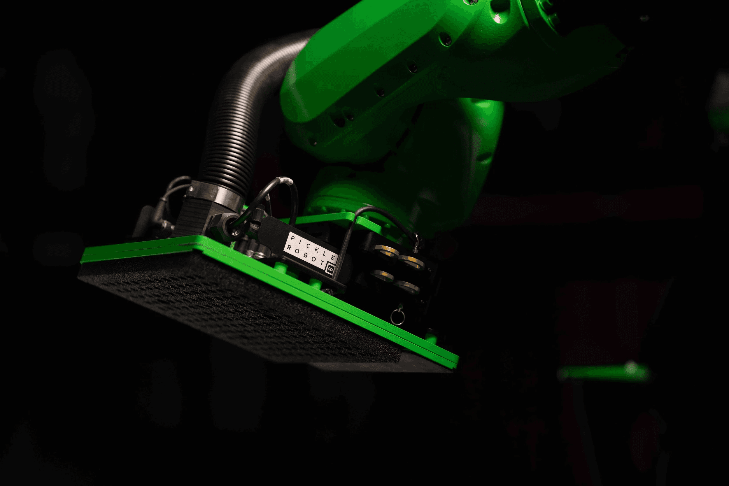
PICKLE ROBOT CO.
Brand Identity
Creative Direction
Art Direction
Web Design
Trade Show Design
Merch Design
A category-defining robot needed a brand to match.
Every robotics company looks the same — blue, sterile, forgettable. Pickle Robot Co. builds high-speed, AI-powered piece-picking robots for warehouse fulfillment, and their technology is genuinely category-defining. But the brand hadn't kept pace.
Our identity for Pickle Robot creates something rare in the space—tech-forward confidence with real human warmth. The visual system draws directly from the industry itself: micrographics, technical schematics, and actual machine-vision outputs from Pickle's own robots, translated into patterns and textures across every touchpoint. An industrial palette of Off-Black and Pickle Green cuts through the corporate sameness, while Aeonik Extended gives the typography a grounded, impossible-to-ignore presence. I art directed a two-day on-location shoot to bring the whole system to life — product, people, and process captured with the same precision the robots deliver daily. The result is a brand that speaks credibly to operations leaders while making clear that Pickle Robot isn't a technology of tomorrow. It's already here, already working, and already winning.


THE APPROACHABLE ROBOT
Physical AI is a category that could easily default to cold and clinical, but we needed Pickle Robots to feel like teammates, not machines. We grounded the brand in three principles: practical with personality, approachable for all, and intelligence without arrogance. The idea is that a warehouse operator and an enterprise buyer should both feel spoken to, not talked down to. Chartreuse became just one visual expression of that ethos. Sitting between yellow and green, it is equal parts nature and neon, energetic and unexpected, impossible to mistake for another industrial brand's safe blue or gray, while cutting through the seriousness of the category.

EXTENDING THE METAPHOR
For trade shows, the challenge was balancing two things that don't usually sit together: a genuinely sophisticated physical AI system and a booth experience that felt fun, human, and easy to walk up to. The answer was pickleball. It's a sport built on the same energy we wanted the brand to carry, approachable, social, a little playful, but with real skill underneath. We built a full activation around it, a branded court, custom paddles, branded balls, all carrying the brand's color system and voice into a physical space. The name pun didn't hurt, but the deeper logic was strategic. We wanted prospective buyers to associate the brand with warmth and welcome before they ever saw a spec sheet.
That approachability was never meant to undersell the technology, it was meant to earn the audience's attention long enough to show it. Photography and video from the activation paired the pickleball moment with imagery of the robots themselves in motion, precise, powerful, clearly built for serious industrial work. The contrast was intentional: a friendly front door into a company doing genuinely advanced physical AI. Visitors got pulled in by the court and the color, then walked away having actually understood what the robots can do. That's the throughline of our approach to in-person brand moments, disarm first, then demonstrate the depth.


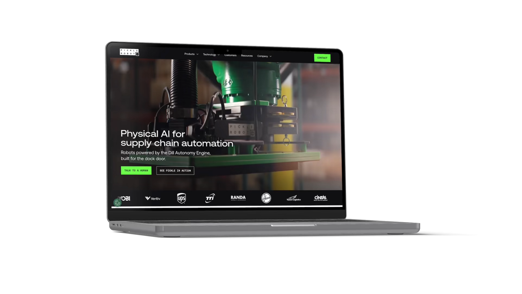
BUILT FOR USERS, NOT JUST CUSTOMERS
Pickle Robot needed a site that could speak to a warehouse operator sizing up a new tool and a Series C investor sizing up a category, often in the same scroll. We built the site to scale with that range: a flexible system of layouts, motion, and content blocks that lets the team introduce new products, case studies, and proof points without rebuilding the foundation each time. Video and animation carry most of the weight, because a robot working alongside people reads as a teammate on screen in a way a product shot never quite manages.