
AAVRANI
Packaging Design
Illustration
Art Direction
An Indian-inspired skincare brand needed to move from on-trend to unmistakably rooted in heritage.
Aavrani came to me just ahead of a full brand relaunch, moving from a more conventional look to something vibrant, youthful, and rooted in the specific colors and ingredients of India. Working directly with founder and CEO Rooshy Roy and her marketing team over five months as art director, illustrator, and packaging designer, the job was never to invent a generic "Indian-inspired" aesthetic — it was to translate Rooshy's own blend of Eastern heritage and Western diaspora life into something that could live on a shelf.

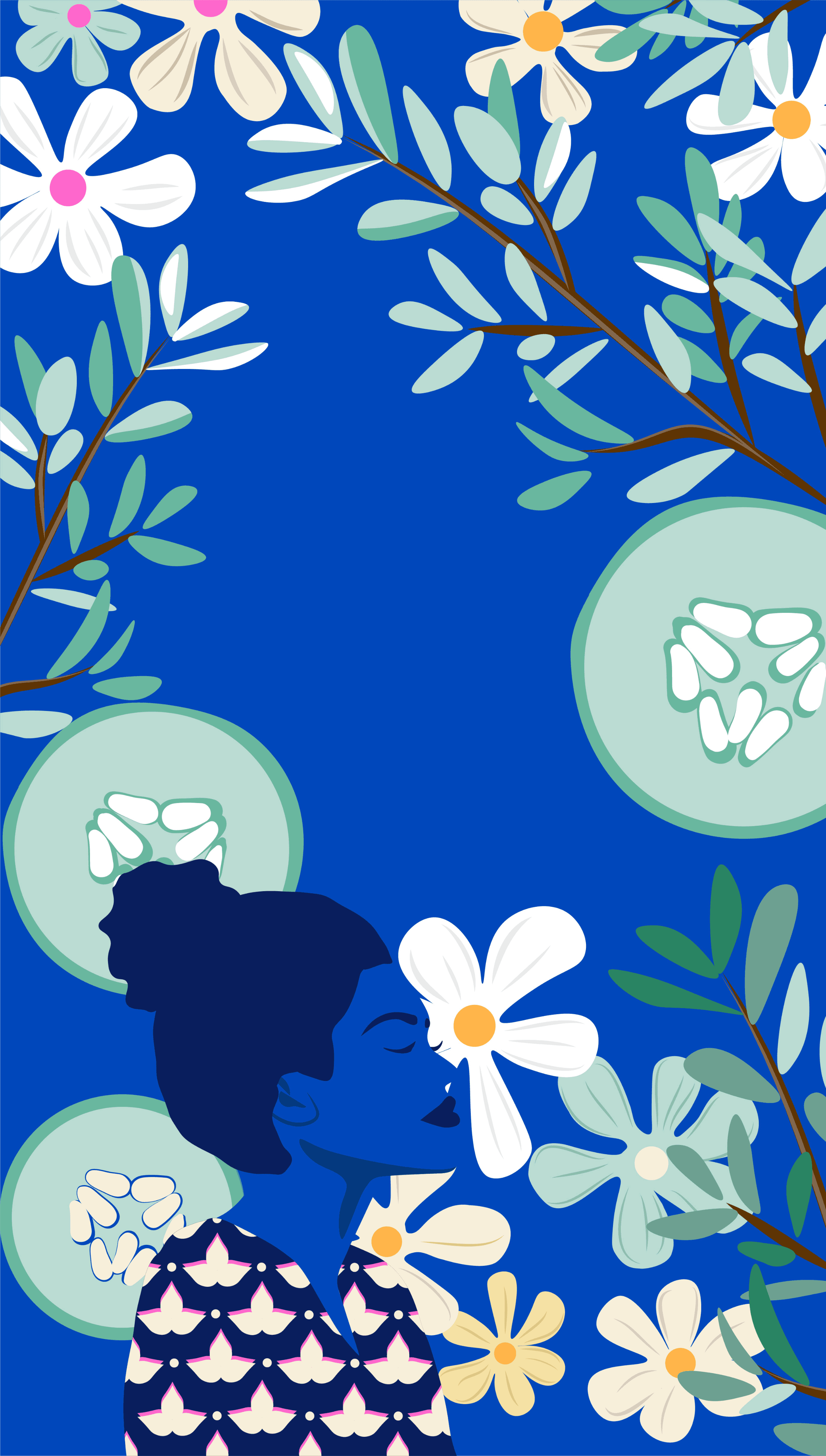
ILLUSTRATING TWO CULTURES AT ONCE
The brand had to hold Indian tradition and modern diaspora identity without either one flattening the other into decoration. I developed original illustration work drawing on that dual influence — pulling from color, pattern, and ingredient imagery that felt specific rather than borrowed, and building a visual language young enough to read as contemporary beauty while staying honest to where it came from.


ONE VISUAL LANGUAGE
Custom artwork for each of Aavrani's four hero products came first, then the harder part: taking that art into packaging layouts and structural dielines that hold together as a family on a shelf. Each product needed its own identity within a system tight enough that a customer could recognize the brand from three feet away, whether they were looking at the HydraWhip or the Eye Elixir.


